Introduction
TRI-CORE’s brand identity was developed to reflect the strength, scale, and precision of a large heavy construction company. The bold typography communicates durability and authority, while the integrated arrow introduces movement and forward momentum. The result is a clean, powerful mark that embodies structural integrity and progress.
Strategy & Solution
We positioned TRI-CORE as a foundational force in construction, leaning into heavy, engineered letterforms that mirror steel and concrete. The arrow element symbolizes efficiency and decisive action, cutting through the structure with purpose. A black and orange palette reinforces industrial strength, visibility, and confidence.
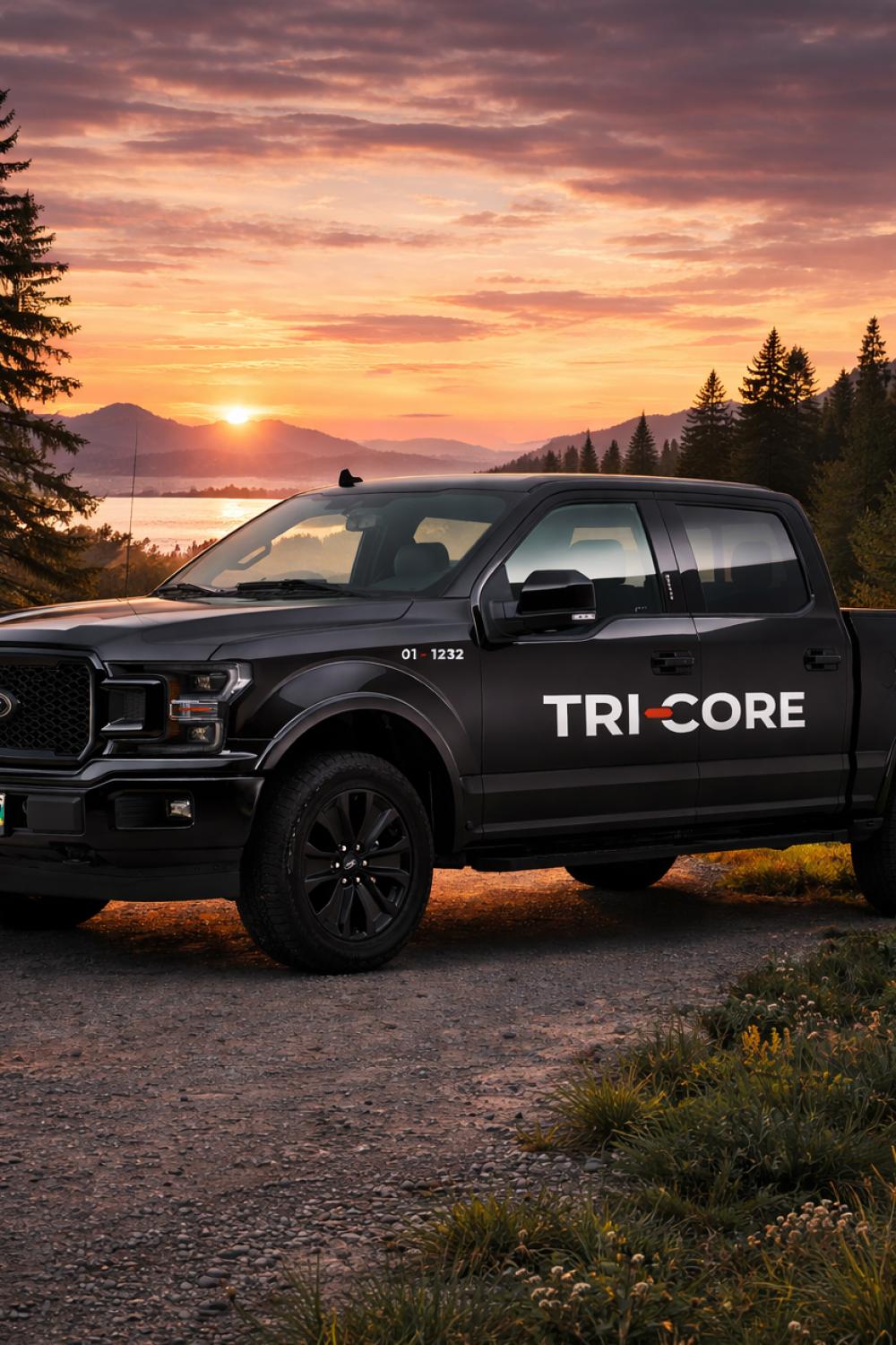
Implementation & Results
Designed for impact across equipment, fleet, signage, and digital platforms, the identity maintains clarity and strength at any scale. The simplified system ensures strong recognition while supporting dynamic brand applications. The outcome is a bold, cohesive presence built to stand as solidly as the projects TRI-CORE delivers.